Colour of the Year 2016
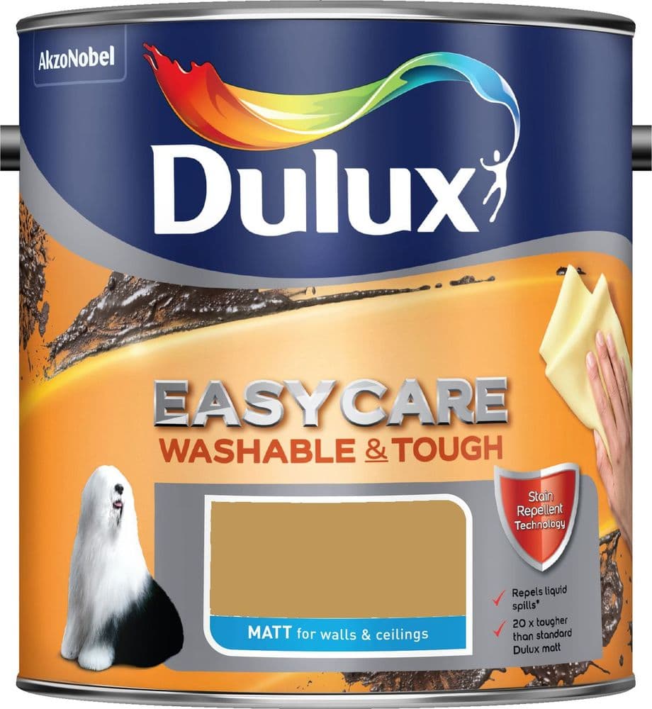

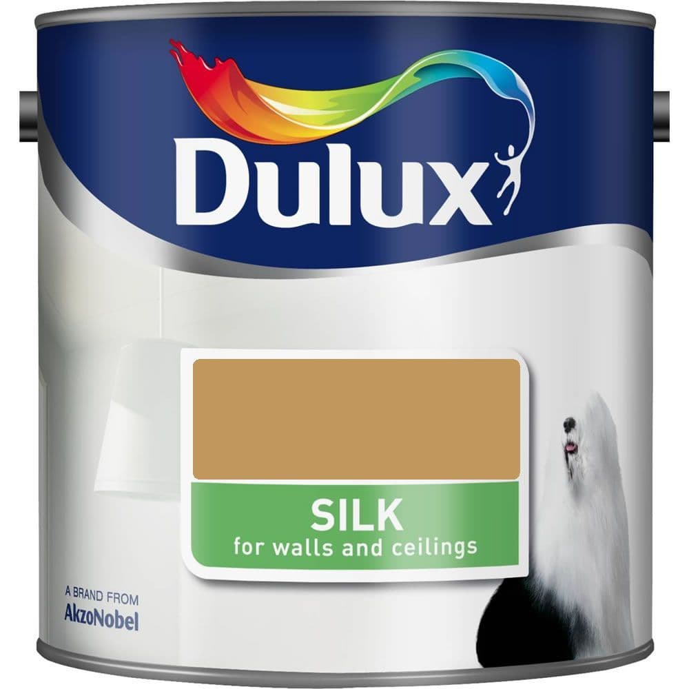

Paint and colour expert Dulux has announced that its 2016 Colour of the Year is Cherished Gold.
Selected by a global panel of colour and design experts, Cherished Gold is a gold-influenced ochre, which can be used alone as a statement shade or in combination with other hues. The choice echoes a general design trend away from accents of copper towards warmer golden metal tones. ‘It is a recurring colour and material at design fairs and in graphic design as well as in architecture, fashion, beauty and interior decorating,’ says Rebecca Williamson, Dulux’s Senior Colour Design & Content Manager.
Ochre is a shade that runs through all of Dulux’s key palettes for 2016. The collection has a sophisticated, muted feel. ‘Think coral, not orange; ochre not yellow and midnight, not blue. This is a friendly palette but with a dark, mysterious side,’ says Williamson.
For a light-hearted look at Cherished Gold, see http://www.tools-paint.com/blog/2015/11/03/cherished-gold-or-50-shades-of-grey/

Take a look at the Colour of the Year Palette:

In this category we gathered all Dulux paints available in Cherished Gold.
